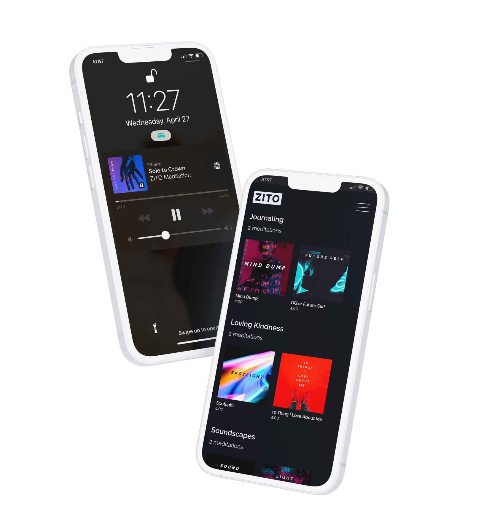
Mobile App Design :: Branding
ZITO
-
I was the sole designer working with one engineer.
This mobile app had a variety of stakeholders including three youth leaders/meditation specialists and a youth group committee. -
6 weeks from concept to implementation
-
Mobile App Design & UX
Branding guidance / style guide.
Problem & Goal
Not all youth audiences have equal-access to the practice of mindfulness & self-care. Mindfulness awareness practices have proven to be critical in substance use prevention, but current apps such as Headspace & Calm simply do not relate to the challenges urban youth groups face.
ZITO, an acronym for ‘zone in, tune out’, is a meditation app resource created specifically for urban youth with the goal to provide a better, more relatable resource for mindfulness.
Brand Discovery
ZITO was only a concept with a functionality outline when I was brought onto the project. To start, I needed to define a brand identity that would strike the right tone with our users.
I collected 2 directions to present to the stakeholders and youth groups. I took inspiration from objects of pop culture and other Gen Z focused brands like TikTok & Spotify. Since my stakeholders were unfamiliar to product cycles, I also added an educational angle by breaking down the effects these choices will have across their platform.
The group ultimately voted for the second direction, titled “MODULAR”. Feedback was given both in-person and also collected in written form. Direct quotes & feedback from the youth groups included:
“Definitely direction 2, that’s a hit. The gradient theme in the background of photos wouldn’t be a bad thing but honestly direction 2 is way more engaging”
“I like the calming colors from the gradient”
“I like the modular selection screen. It’s like clean and organized and easy to look at. The dark mode style is cool”
“I like the modular because it looks nice and organized when you’re looking for it. But then when you click on the shit, everything should be focused, like boom, you feel me?”
“Ohhh yea I f*ck with that. I f*ck with the modular.”
Design
With the approval on a visual direction, I began to wireframe core pages with the modular feel in mind. I took a collaborative approach with the engineer to ensure that my design thinking stayed within scope.
My approach to the design and UX was focused on the following:
Make it easy for users to see and explore the different meditations and categories.
When a meditation is playing, minimize clutter/stimulus on the screen to encourage focus and rest.
Avoid unnecessary onboarding or welcome screens - our users often go to this app during times of stress or anxiety.
Stakeholders emphasized their mission for the content of the meditations is around relatability and inclusivity. Avoid imagery or language about things that are out of reach for urban youth groups (for example: a calming Hawaiian beaches, exotic destination landscapes, luxurious spa scenes, etc)
Create a design that avoids the cute/silly feel of apps like Calm
After receiving engineering buy-in from my wireframes, I developed a simple style guide that allowed me to develop type and color styles in Figma for rapid hi-fi designs. I also created a new logo for the app with formats that would be scalable for different sizes and orientations.
Styles and Logo
Challenges
One of the primary challenges that arose during the project was within creating an accessible design approach for the stakeholders. This was a grant-funded project at a very early stage. The app launch was scoped to include about 20 meditations, but may double in content after the project.
I wanted for my design approach to follow a consistent technique for displaying meditation artwork so that this team did not have to be locked into using my design resources every time they needed to add an additional meditation. Another major consideration was to keep costs low - so relying on expensive stock imagery or illustrations should be avoided.
I decided to emulate an album cover style, harkening to a Spotify-type feel instead of the “cute” and whimsical feel of other apps. I created a series of components in Figma including a base image and title that could easily be replicated for future covers. To avoid stock photo costs, I stuck with Unsplash for a free photo resource.
Album cover components
Results
The app was designed, developed and approved for the app store! 🎉
After launch, ZITO has continued to receive positive feedback from the youth groups connected to the stakeholders, and currently holds a 5 star rating on the app store from a small user base.
😌 Want to download ZITO for yourself? Get it on the app store here! 😌


