Product Design :: eCommerce Integration
Extend Purchase Experience
-
I redesigned Extend’s key customer touchpoint, the protection plan offer modal, to significantly increase revenue while also implementing a more flexible and scalable design solution.
-
Lead Product Designer (from inception)
-
Approximately 1 quarter per redesign (3 different pushes)
Overview
Extend is changing the extended warranty industry with tech-forward solutions that provide a better product protection programs for both merchants and their customers.
As an early employee to the now unicorn-status startup, I had the pleasure of being Lead Designer for Extend’s purchase experience – owning and iteratively optimizing the company key revenue-driving touchpoint. In this case study I will focus on how I enhanced the ‘offers’ UX in order to increase revenue and implement a more scalable solution for the future.
Challenges & Goal
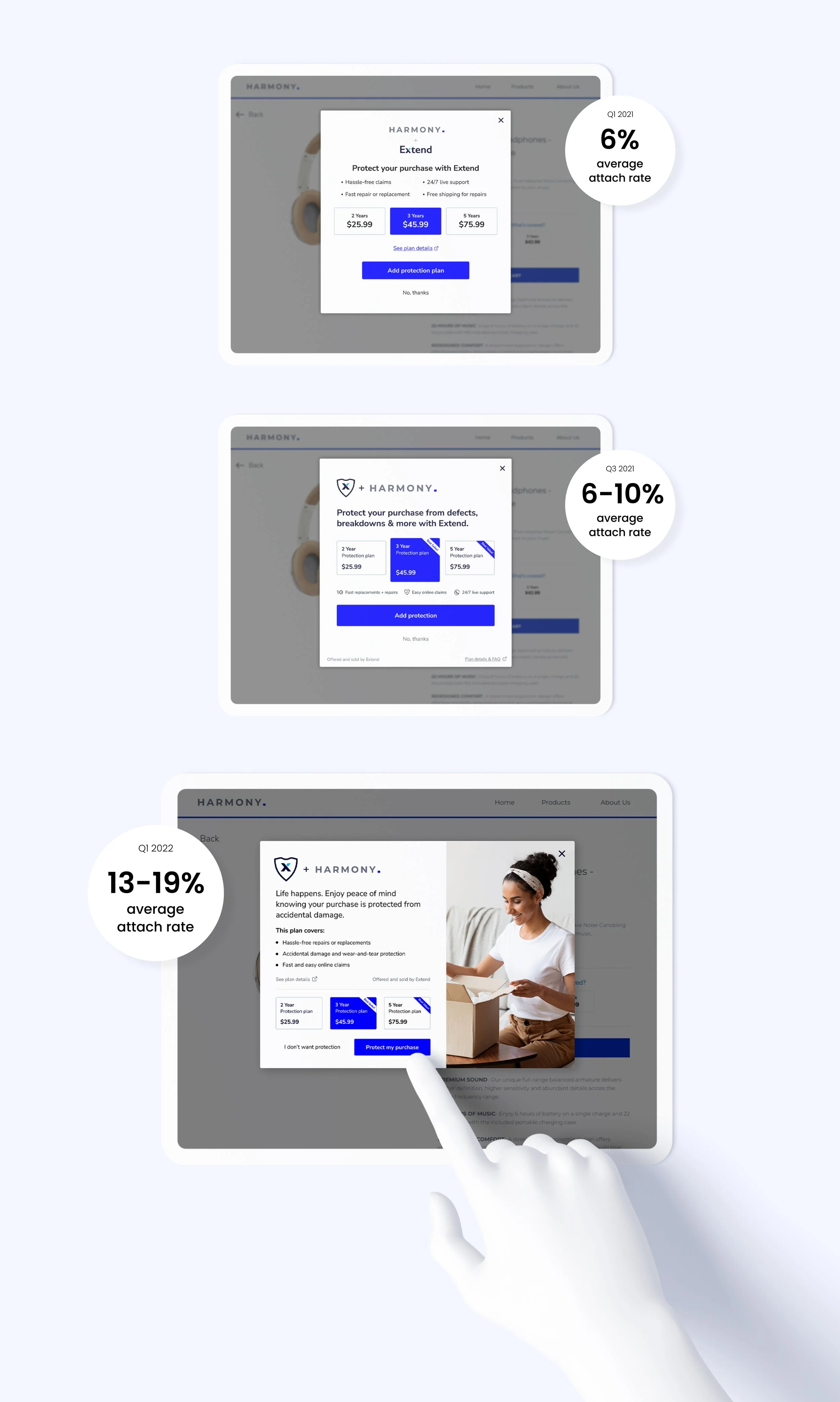
Extend’s protection plan offer modal is a one-size-fits-all integration that allows hundreds of online brands to offer their customers protection plans on millions of different products. As an early employee at the company (and only the 2nd designer), Extend purchase experience was only months-old and had a very low performance rate (~6%).
The primary goal was to optimize the offer to increase attach rate (% of protection plan purchases from the modal offer), which directly impacts the revenue of Extend and the merchant partner. There was also a great deal of pressure from Extend’s partners to redesign this modal offer to have the ability to be more branded to all of our different partners.
The biggest restraint on the redesign was on the backend. Extend’s offers are an SDK integration (software developer kit), which creates a variety of restrictions around the flexibility one can have when adding this modal to their store. The SDK meant elements such as text containers, buttons, and image containers need to stay in the exact same placement for every store that uses the offer. Naturally, that presents a huge lack of customization for store branding and different layouts to express different kinds of coverage details (coverage details for an electronic vs. furniture vary greatly, etc).
The original modal offer had the flexibility for a merchant logo to be present and for a brand color to be used. However, the benefits listed were generic across every store and plan type, and the logo lockup often appeared uncentered and clunky. This modal had an average attach rate of under 6% for most merchants.
The offer modal is automatically triggered when an eligible product is added the the cart. The original offer modal had a low performance rate, and offered little flexibility for branding, coverage details and more.
Redesign 1.0
Within my first few months at Extend, we had the opportunity to pull some engineering resources into a first redesign of the offer modal. With Extend only being at its Series B funding, we were unable to put time or money into a user study. I tackled the redesign based on a few assumptions, competitive research and merchant feedback.
We knew that many customers were not being sold on the offering, one assumption I made was that the current plan options were not clear or engaging for the users. I also believed that the current benefits were not offering much value - and taking up a large amount of real estate. We also had received merchant feedback about the current layout of the logos, square logos appeared too small in the current container and other orientations of logos often looked uncentered.
For the first redesign, I focused on the following based on the assumptions above:
Allow for a dynamic, more plan-specific headline.
Establish a hierarchy that prioritizes the pricing and term lengths of each plan.
Emphasize the most popular plan to help drive sales with a badge or visual.
Find a layout solution that would elegantly accommodate any orientation of a logo.
Ensure the redesign remains mobile-friendly.
Results
With the launch of this redesign, we did see an uptick in performance. For some merchants, the average attach rate rose to 10% - which could offer tens of thousands of revenue dollars per month.
Testing
Although the initial redesign resulted in a rise in attach rate, we still did not know why it was working better.
At this stage, Extend had just received its Series C funding and scaled from 50 to 150 employees. With new resources available myself and the new team of 3 designers built a research study to test my redesign with a qualitative Userlytics study.
Our research goal was to better understand why customers did or did not purchase an Extend protection plan after being served the modal in a store prototype.
The study revealed several key insights, including:
A majority of users don’t know what is included in an extended warranty, and underestimate the coverage benefits.
Users generally have a bad perception of warranties, because they don’t believe they’ll be covered when they need it, and that there will always be a difficult customer service portion.
Users consistently compared the price of the plan with the amount of benefits shown to be included. Users strongly associated coverage details with the value of a plan.
A majority of users said that they only add extended warranties if they could forsee certain types of damage happening to that product. (For example, stains on furniture or cracking a phone)
Redesign 2.0
My visual direction for the redesign 2.0 was strongly based on the results of the user study - especially the insights that showed customers relate coverage details to value.
Another goal was stemmed from the company’s need to support the needs of enterprise merchants. The first redesign did not move the needle significantly on allowing more branding customization within the SDK, and although there was an addition of icons, flexibility for different button colors, and more headline space- we continued to receive feedback that the offer did not feel natural on merchant’s online stores.
Based on this feedback, the new redesign focused on:
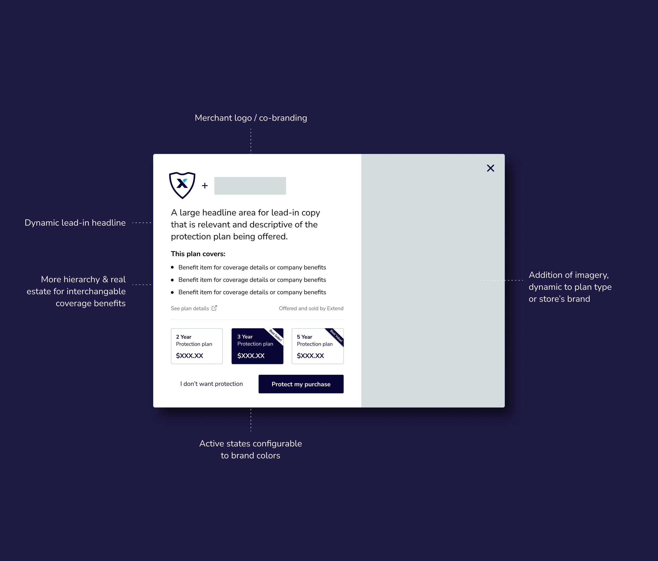
Reconfigure the current layout to include more information to explain what the protection plan includes.
Place more hierarchy on those coverage details and/or benefits of using Extend - this is where users will find the most value.
Be sure to include a line item that focuses on our easy claims process.
Overall, try to make the modal more engaging visually to make the experience feel more natural and merchant-branded.
Must also work within the restrictions of the SDK, keeping consistency in the layout and placement of text and containers.
After pitching several concepts varying in interaction, the stakeholders approved the version that was fastest to build and still accomplished the hierarchy updates and branding flexibility.
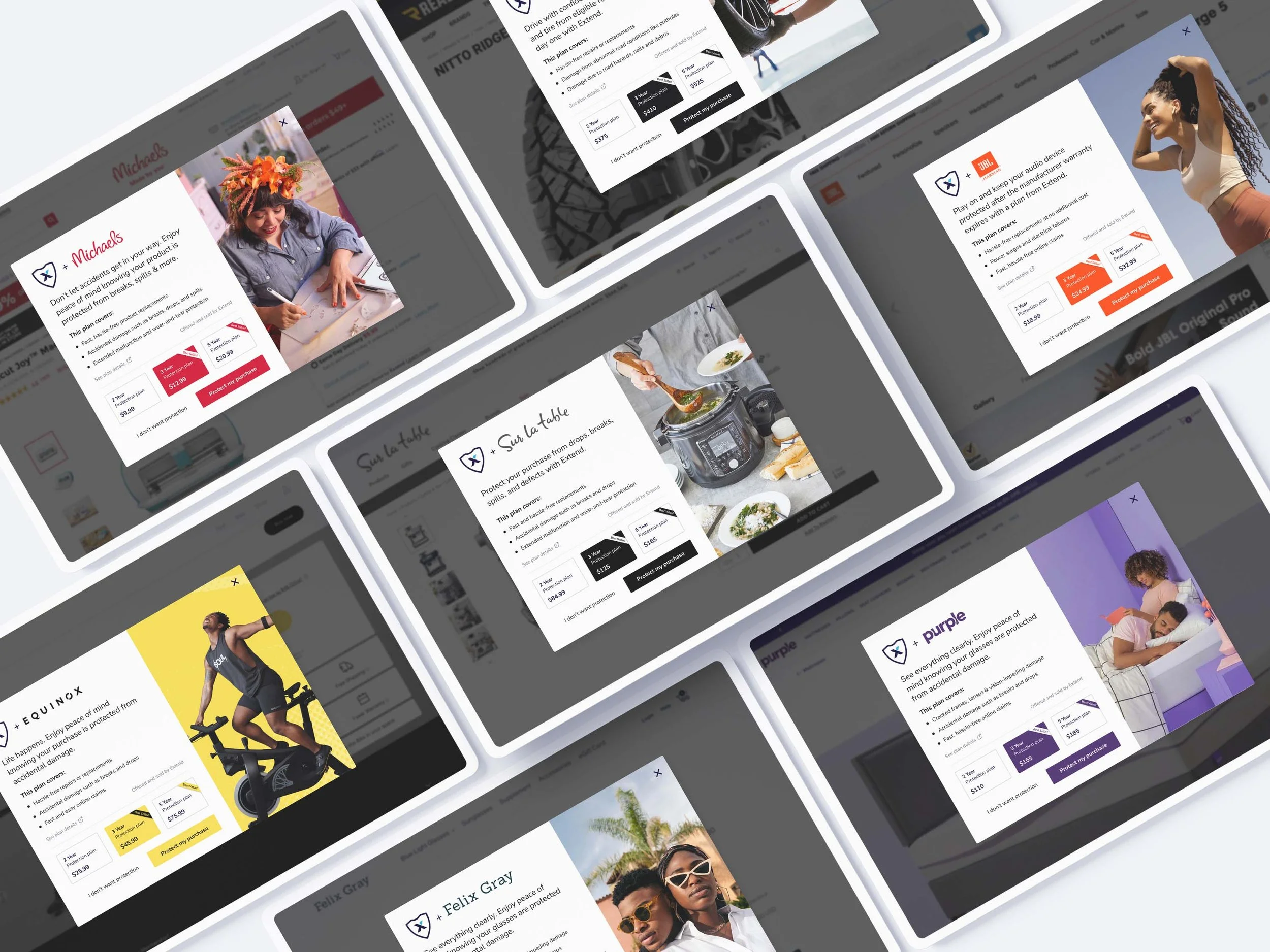
The modal redesign emphasizes the value of Extend’s protection plans, and allows for a more branded experience for hundreds of merchants.
Results
With the modal layout optimized to emphasize the coverage details, along with supporting interchangable content to showcase more relevant headlines and images, the latest redesign has shown to be effective and significantly more profitable.
Extend’s merchant partners who have implemented the new modal have seen anywhere between a 13-19% average attach rate, which is over 2x from the previous modal’s performance.
An additional benefit from this design approach was a new level of customization available to Extend’s merchant partners, which is a unique solution unseen in similar Saas products.
This configurability is now used as a competitive differentiator during the sales process, and has also kicked off upcoming features for further flexibility to the SDK offers in order to support typography styling, dark mode and more.
In addition…
With the success of the offers redesign, myself and the design team became a point of contact for merchants on how to best customize offer content.
With scalability in mind, I kicked off and lead the designs for photography guidelines specifically geared towards imagery choices for co-branded touchpoints such as the modal. These guidelines accompanied a large image bank that I collected that could be used for different product categories.
These documents helped optimize and streamline the writing and imagery choices for retailers who may be serving dozens of product categories with unique modals (electronics, jewelry, furniture, appliances, etc), as well as create consistency among the designs our growing team creates.
👋 Want to learn more about Extend? Check out Extend.com 👋


