SaaS Software :: Product Design :: Design Systems
Julota
-
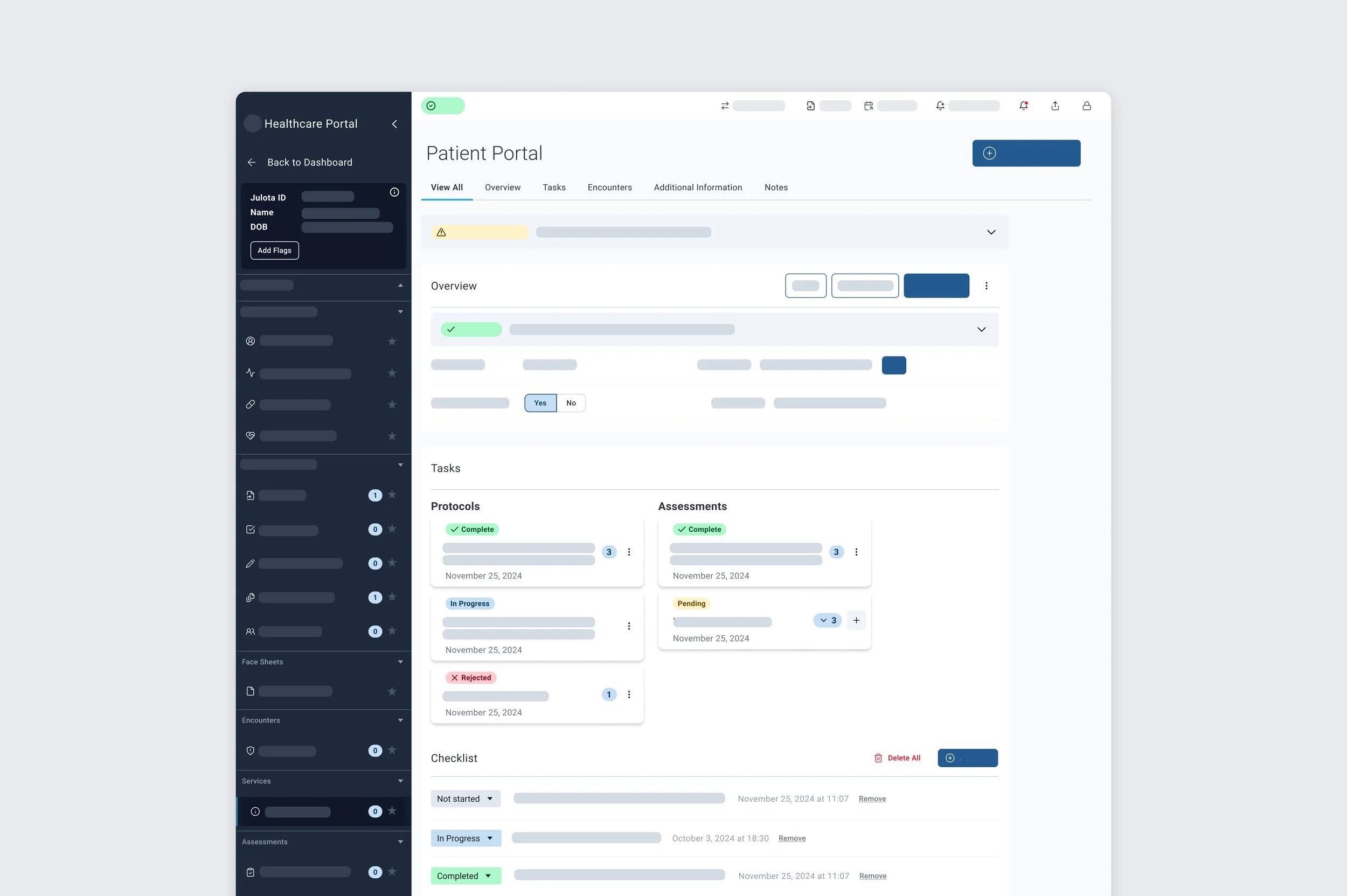
Julota is a healthcare SaaS platform focused on improving community paramedicine and crisis response. I led a complete redesign to prioritize usability for first responders, created a new component library to establish and maintained a scalable design system, and developed design principles to guide their team. Additionally, I served as a design consultant to ensure the platform's growth potential and enhance its user experience.
-
As the lead designer and contract design consultant for Julota, I worked for six months to overhaul their platform. My focus was on enhancing usability for first responders, creating a new component library for a scalable design system, and establishing guiding design principles for the team. My work aimed to ensure the software's long-term growth while streamlining its user experience.
-
6 months
Overview
Julota is a healthcare SaaS platform that focuses on community paramedicine and crisis response. The project involved redesigning the user experience for first responders, creating and maintaining a scalable design system, and establishing design principles to guide future growth. The one-year collaboration aimed to streamline operations and enhance platform usability for emergency healthcare professionals, ultimately improving coordination and response times in critical situations.
Designing from the System Out ⚙️
To tackle this multi-platform redesign, I took a systematic approach—starting with the heart of it all: the design system.
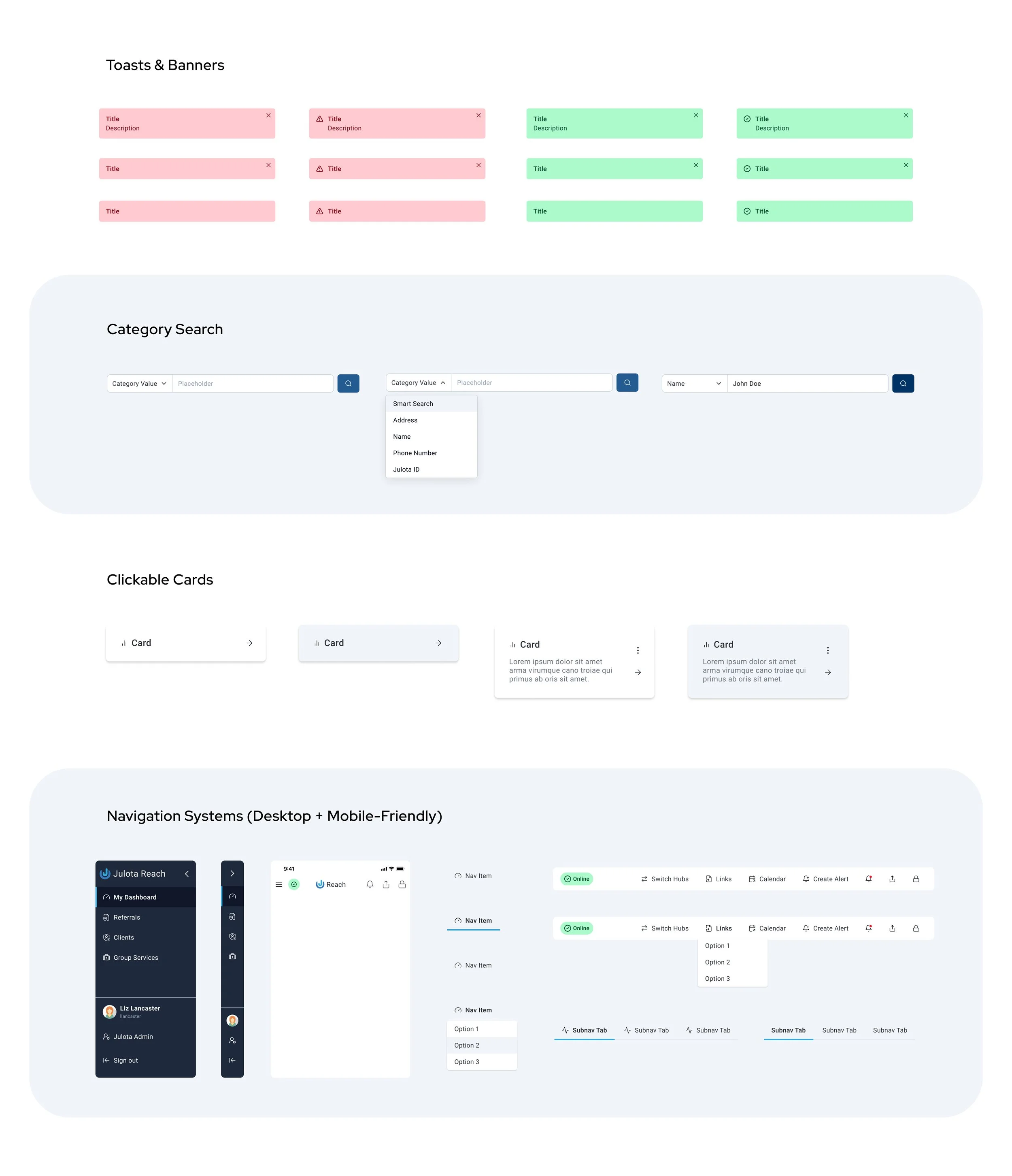
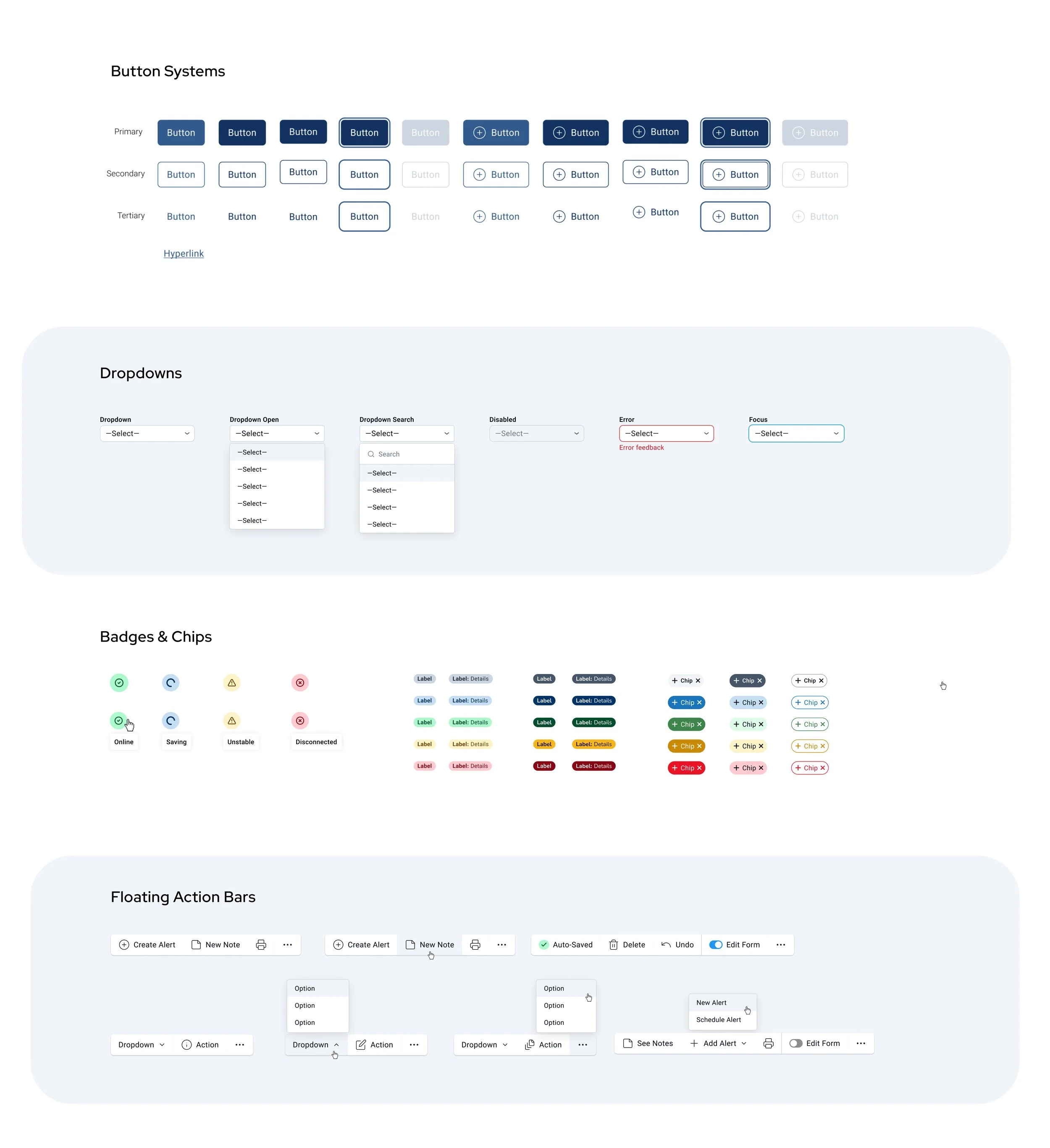
I created and maintained a unified design system that defined the visual direction, interaction patterns, and usability foundations across Julota’s three core portals: Auth, Reach, and Admin. This system guided every design decision moving forward, enabling the team to tackle problems at scale, ensure HIPAA compliance, and maintain consistency as the platform evolved.

Aligning Stakeholders Through Design Principles
One of the biggest challenges in this project wasn’t just the complex workflows or the rapid pace of redesigns—it was achieving alignment across a very busy, highly technical stakeholder group. I worked directly with the Chief Product Officer, CEO, PM, and engineering team, and while everyone shared the same goals, conversations often got deep into technical functionality rather than user outcomes.
As a result, meetings frequently stalled over the “how” instead of the “why.” To refocus the team on our users and the purpose behind the redesign, I introduced a set of four Design Philosophies—guiding principles that grounded every UX decision, created a shared language, and helped keep the team aligned on what mattered most.
Break out & Organize where possible
Our users are busy, on the go, and appreciate easy to read data. Utilize sections, tabs, and cards with intuitive, easy-to-understand titles and labels to make it fast and easy for users to find information.
Design with Clarity
Ensure that our users will never be lost or confused due to visual choices. Use labels for unique, Julota-specific actions (instead of only icons). Utilize subheadings, tooltips and descriptive call-to-actions.
Accessibility is key
Contrast and key functions that comply with the WCAG 2.1 AA/AAA standards must be more than implemented, but championed.
Deconstruct assumptions
Intuitive flows look different for different users, never assume that a singular action or flow will be easily understood. Welcome multiple avenues to complete important actions, even if it seems redundant.